Brief
Taking the heritage of its beginnings in London, re-branding ‘Revelation’ to ‘Revelation London’, a fresh contemporary brand in the luggage market. Designed in London built for the world.
Revelation is a travel goods brand, founded in 1923, Piccadilly London. Now based in Kings Cross, the brand has changed a lot in its 90 years, however it's visual identity needed a clear direction and contemporary visual overhaul. updating the name to Revelation London. Proudly displaying the city Revelation called home for so long. Aimed at a younger, travel driven, design aware audience. Capitalizing on the capitals rich history of design, culture and attitude adding value to the brand experience.
“Harry [Hyper Zero Plus] was able to work in close collaboration with product design, sales and merchandising to deliver a vision that was both practical and inspirational. Truly a ‘one stop shop’ in the most positive sense of the term, Harry has been able to ensure the thread of his vision runs through the functional areas of the business and is communicated in a clear and insightful way to our customers so they too understand what Revelation London is and will be.”
Gavin Meech - Sales Director
Customer Profiles
Customer profiles are a great way to get a feel for the audience you are trying to reach. Understanding their needs and looking for problems to solve, adding value to the connect the brand to a community.
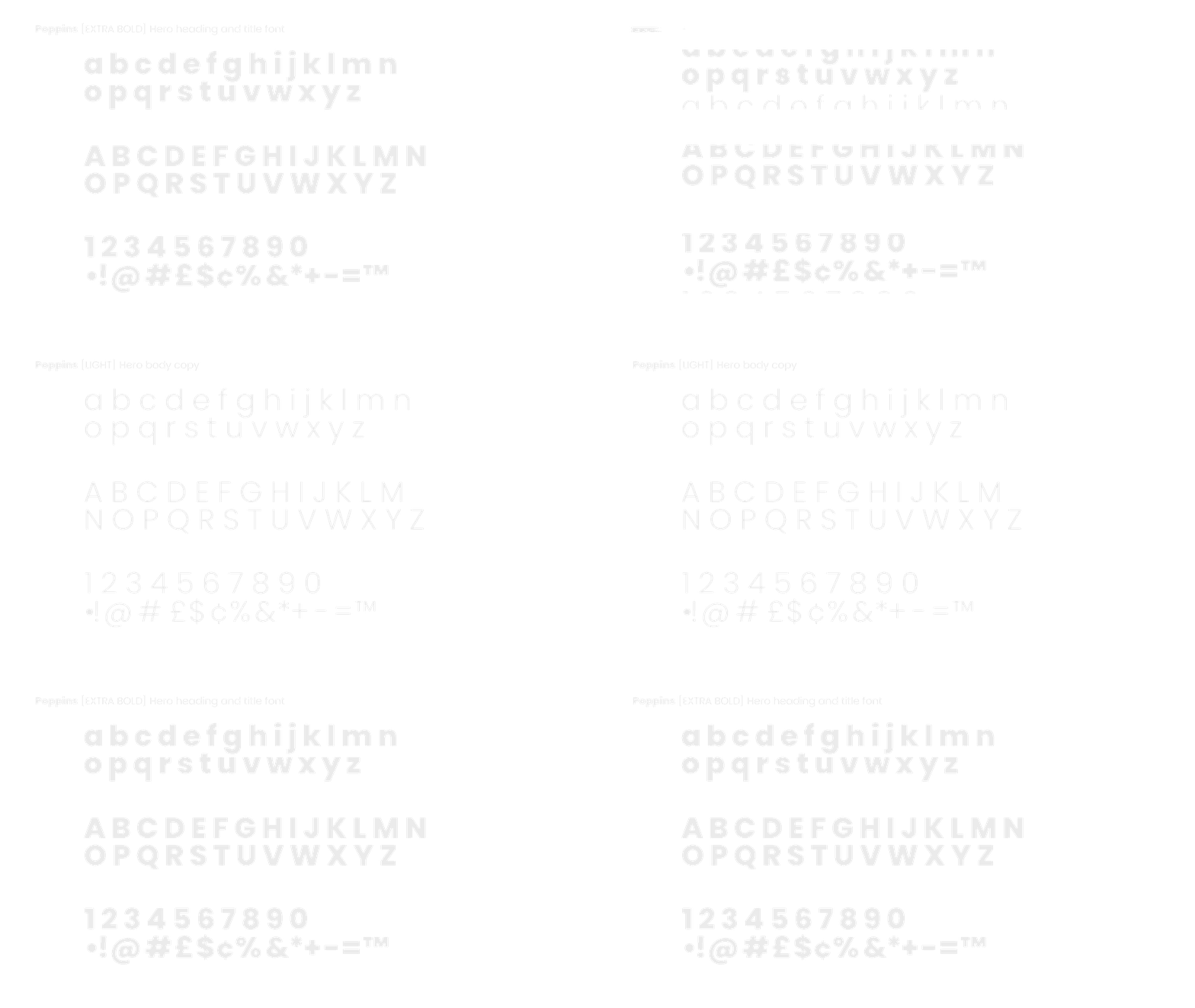
Typography
Poppins designed by Jonny Pinhorn for the Indian Type Foundry is an internationalist take on the geometric sans serif typeface.
Each letterform is nearly monolinear, with optical corrections applied to stroke joints where necessary to maintain an even typographic color.
Logo
When designing any logo I keep Sagi Haviv's 3 rules for a great mark in mind.
#1 Appropriate #2 Distinctive #3 Simple.
The inspiration for the logo came from the London street signs on every corner of the city that help us get around. Wearing the area postcode of the head office as a proud badge in the WC1. Futura is classic, contemporary feeling and timeless typeface and an easy decision that matches the tone of the brand as well as being condensed to help tighten the spacing for the longer brand name. The logo has 2 variations, first the badge for on product branding the second for larger spaces. This makes for a very flexible and versatile branding system.
01. Hero/Wordmark - Full logo up 02. Hero/Icon/Badge - Disemvowel
Animated version to highlight the global/local direction.


